Accessibility
Design System Revamp Process
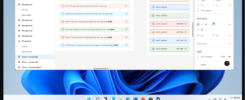
As we work towards the beta release of Tricentis Test Automation (TTA) by July 2022, we’re confronted with a pressing challenge: our current design system lacks scalability and comprises minimal components.
In addition to meeting our ambitious deadline, we are also committed to achieving WCAG Level AA compliance. This revamp isn’t just about looks; it’s a strategic effort to ensure design consistency, scalability, efficiency, and accessibility in our development process.
Follow along on this transformative journey, driven by the urgency of our impending beta release and the aspiration to set new standards in design and usability within the testing automation industry.

UX Role
- Designer
- Researcher
Working closing alongside UI Designer and UX Manager
Tools
- Figma
Timeline
- Jan – March, 2022
Problem
Goal
A scalable and comprehensive design system equipped with an ample range of components, that will support the design of Tricentis Test Automation (TTA) as well as other products within the Tricentis portfolio.
Background
In July of 2021, I joined the UX team as the design system lead due to my prior experience as a web designer. During my tenure at the University of Central Missouri, I contributed to the university’s style guide, which further strengthened my qualifications for this role. The existing design system, Aura, was limited in scope, primarily supporting a small number of Tricentis brand products. Upon review, several issues were identified:
- Inconsistent Component Construction: Some Figma components lacked proper construction, including responsiveness and auto layout.
- Limited Component Variety: The design system lacked a comprehensive range of components and variants.
- Accessibility Concerns: Certain components did not meet WCAG 2.1 level AA accessibility standards.
- Documentation Gaps: Comprehensive pattern documentation was missing.
- Versioning, Organization, and Adoption Challenges: Multiple component versions, disorganized components, including duplicates without clear usage guidance, led to inconsistencies and hindered designers’ adoption of the system.
- Cost Considerations: Expanding the system manually would be costly.
As 2021 came to a close, preparations for Tricentis Test Automation’s development began. The design system team grew to two members with the addition of a new UI designer. With a tight deadline for a summer 2022 beta release, it became clear that an enhanced design system was crucial to expedite development. Given the time constraints, we decided to purchase a pre-developed UI kit and accompanying code. I researched and proposed potential kits, laying the groundwork for further project advancement by the front-end architect, VP of UX, and project manager.
Recommendation Process
Since my days at the University of Central Missouri, I’ve employed a four-step software research process that I consistently follow.
- General Search: It begins with a broad search using relevant keywords to gather leads and discover product names. For instance, searching for “Best React UI library” or looking for alternatives, like “Photoshop alternative,” provides a starting point.
- Evaluation: I meticulously assess each suggested product, eliminating those that fail to meet criteria or requirements, retaining those showing potential for further consideration.
- Review and Feedback: I delve into platforms such as Reddit, Stack Overflow, or GitHub to peruse reviews and user experiences, gaining insights into each product’s strengths and weaknesses.
- In-Depth Analysis: After narrowing down the options, I delve deep into each product, examining features, capabilities, and suitability for specific needs. This thorough evaluation ensures informed decision-making.
Utilizing this method, I identified several contenders
MUI and Ant Design as the strongest candidates.

In my proposal, I provided detailed descriptions of each, highlighting their respective pros, cons, and associated costs.
Pros
Active Community: MUI has a large and active community of developers and designers who actively contribute, offer support, and share resources.
Theming and Customisation: MUI provides robust theming capabilities, allowing easy customization to match brand identities and design requirements.
Rich Component Library: It offers a comprehensive set of well-designed and customisable components following the Material Design guidelines, which can save development time.
Documentation: It has comprehensive and well-organised documentation.
Ant Design
- Active Community: It has a strong community presence on GitHub, Stack Overflow, and other developer forums.
Customisation: It provides theming and customisation options, making it adaptable to different project design requirements.
Modularity: Ant Design offers a modular architecture, allowing developers to select only the components they need, potentially leading to more optimised bundle sizes.
Documentation: It has a fairly comprehensive and well-organised documentation.
Cons
Complexity: For beginners, MUI can have a steep learning curve due to its rich feature set and configuration options.
Bundle Size: Depending on the project’s needs, using MUI can lead to larger bundle sizes, potentially impacting page load times.
Usability Issue: “Mystery Meat” issue which refers to a design flaw where icons or elements lack clear and easily understandable labels or descriptions.
Documentation: The English documentation can be lacking in some area.
Customisation: The default less, a CSS pre-processor to manage and customise CSS, style language used can be difficult to work with.
Storybook
Customising MUI Steps
TTA manager, + UI designer + 2 UX designers
embarked on customizing the UI kit to align with the design created by our UI designer for TTA.
Challenge
In the initial version, known as Aura 2.0, we encountered challenges where local styles, like colours and typography, still referenced the original MUI kit that was located in a different design file within our Figma environment.
This second iteration, Aura 2.1, was successfully customised within just one week, free from any dependencies on the original MUI kit, and ready for implementation.

VIDEO
A snippet of the transformation from Aura to Aura 2.1 and a quick demo on how a design system can quicken the design workflow.
Governance of Aura
Aura 2.1 was swiftly developed to enable UX designers to create prototypes and workflows for TTA. Following the initial release, the UI designer and I expanded the design system by adding more templates. Alongside this effort, with the guidance of the the UX manager we discussed and established governance of Aura. Our discussions encompassed several crucial topics:
Design System Componenents
- Request and Contribution Process: Guidelines for requesting and contributing new components, including criteria for inclusion.
- Documentation: Procedures for documentation creation, maintenance responsibilities, and the chosen platform for housing documentation.
- Publishing and Versioning: Determination of update frequency, versioning procedures, and communication methods for changes.
- Component Naming: Establishment of a consistent naming convention for components.
- Archiving Old Patterns: Decisions regarding the retirement of outdated design patterns.
- Usage Metrics: Exploration of methods to measure Aura’s usage.
- Company-wide Adoption: Strategies for promoting adoption throughout the organization.
Team Operations and Workflow
Frequency of Team Meetings: Regular team meetings to review progress, address concerns, and maintain effective communication.
Decision-Making Process: Establishment of a structured decision-making process to streamline choices concerning design system updates, components, and patterns.
Ownership: Distribution of responsibilities, including documentation and component-related Jira tickets.
Slack Communication: Utilization of Slack for user requests, issue reporting, and Jira ticket creation.
Component Development Workflow: Procedures for UX team members to contribute components and patterns, including the approval process and release schedule.
With only a small team of two and with Aura 2.1 initially serving a single product, our workflow was straightforward.

Documentation of Patterns
Documentation Tool
In my initial proposal, I had recommended Storybook as the platform for our design system.
My rationale was that, at that stage of the design system’s development, it would be the most cost-effective choice. However, prior to gaining approval and implementing Storybook, I had been strongly encouraged to explore other readily available platforms within the company.
Initially, all the pattern drafts were composed in Word due to its simplicity and convenience for gathering feedback. As we developed design patterns within Word, the Program Manager for the UX team and I considered SharePoint as a potential documentation repository.
However, our efforts to customize SharePoint for enhanced visual appeal and ease of updates had resulted in frustration, ultimately leading to our decision to abandon it.
WordPress was another contender, benefiting from my prior experience. However, implementing it posed challenges related to space, security, and IT resource involvement.
Confluence, an existing company platform, was the next option. After securing space and admin rights, we commenced customization and template creation. While initial progress appeared promising, an unexpected Confluence update erased customizations, restricted access to plugins, and hindered page editing.

Growing increasingly frustrated, I strongly advocated for Storybook’s installation, emphasizing its pivotal role in establishing a single point of truth.
The centralization of components and patterns would grant accessibility to UX designers and developers alike, ensuring that everyone within the company could access design system codes and understand each pattern.
This unified approach would empower all team members to easily utilize necessary components, fostering consistency in design elements throughout the organization.
Storybook Installation
Approved!
Installing and using Storybook ensured company-wide design consistency.

Fancy reading a draft example?
A writing example of the checkbox component. Once approved, the draft was moved to Storybook.
Onboarding Video
To enhance colleagues’ proficiency in Aura and facilitate the effective utilization of its components in their daily responsibilities, and a part of our company-wide adoption strategy, I developed an onboarding video.
Animation was integrated to enhance engagement.
The initial video received a positive response, prompting the subsequent development of another video, tailored specifically to the needs of developers.
Final Note
Aura’s development initially revolved around TTA’s specific needs, slowly it began to attract the attention of teams outside TTA that recognised patterns and components that would fit their use cases. As Aura’s adoption expanded throughout the company, the design team grew alongside it. Initially, I was the sole lead and contributor to the design system, then followed by the addition of a UI colleague. Over time, our team expanded to encompass nine members.
During this period of growth, an exciting UX opportunity emerged. After a year as a member of the design team, I transitioned into the role of a product designer. This shift provided me with the opportunity to further delve into and contribute to the creation of user-centred products within Tricentis.