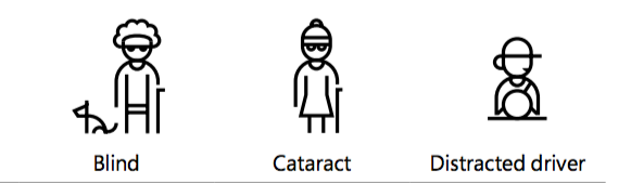
Permanent Impairment: This type of impairment refers to long-lasting or permanent conditions that affect an individual’s ability to interact with digital interfaces. An example of this would be a blind person who relies on screen readers or other assistive technologies to access and navigate digital content effectively.
Temporary Impairment: Temporary impairments may hinder a person’s user experience for a limited period. For instance, someone with cataracts may experience temporary visual challenges, which can be alleviated through surgical intervention.
Situational Impairment: Situational impairments arise due to specific circumstances and environmental factors. An example would be a driver who is temporarily distracted by sunlight, making it difficult to see the screen of a navigation system while driving.
Image source: Microsoft inclusive design
Accessibility is crucial because it ensures that digital content and interfaces are usable and inclusive for everyone, regardless of their physical or situational limitations. Ensuring accessibility broadens the user base and potentially increases the reach and impact of digital content and services.
UX Role
Designer
Researcher
Working closing with compliance officer and two colleagues from the UX design team,
Tools
Figma and Figjam
Timeline
Aug – Sept, 2021
Problem
Our colour combinations for creating toast messages do not align with the Web Content Accessibility Guidelines (WCAG) 2.1 minimum contrast requirement for level AA compliance.
UX team
Goal
Enhance the accessibility of toast messages and consequently ensure that Aura becomes fully compliant with WCAG 2.1 level AA standards.
Background
Upon joining the UX team at Tricentis, an existing design system, Aura, was already in place. However, several issues became apparent:
Some components within Figma were not constructed correctly; for instance, some lacked responsiveness or failed to utilize auto layout as intended.
The existing design system lacked an extensive range of components and their respective variants.
Certain components did not adhere to WCAG 2.1 level AA accessibility standards.
There was an absence of comprehensive documentation for the components in the system.
With my background in web design and style guides, I was given the role of adding, updating components, and documenting design patterns. As an SAP partner, aligning our design system with WCAG 2.1 level AA standards was also a key priority.
Learning Process
Ensuring accessibility for Aura and all future designs was paramount for the UX team.Besides myself, there were two other UX designers who devoted a significant amount of time to understand the WCAG guidelines. Independently, we embarked on learning as much as possible about accessibility and WCAG. To stay on track and align, we met once a week to discuss various topics related to our findings.
Ana
Theodora
Me
Challenges
Some of the guidelines within the WCAG website was difficult to understand.
The absence of an in-house accessibility specialist we could seek advice from.
A limited budget made it impossible to hire an external consultant for assistance.
Adaptation
Looked for alternative resources: Sought out blogs, articles, or video tutorials that simplified and explained the WCAG guidelines in a more accessible manner.
Leveraged free resources: Utilized freely available online accessibility resources, guides, and checklists to implement basic accessibility improvements.
Prioritized the most critical issues: Focused on addressing the accessibility aspects that could significantly impact user experience and inclusivity.
Resources Found
WebAIM, offers straightforward and user-friendly explanations of web accessibility concepts. They provide numerous examples with images to help you better understand the principles and implementation of accessibility.
One of the critical issues we chose, which we thought would bring most significant impact, was colour.
In alignment with industry norms, Tricentis has chosen its own unique colour scheme to convey the brand’s identity.
The primary colour is blue, but additional colours like orange and purple are also employed.
Traditional colours like red, orange, green, and blue have specific purposes: – Red for alerts. – Orange for warnings. – Green for success indicators. – Blue for information cues.
During the Aura refinement, we took into consideration the Tricentis colours and the desired product appearance. However, when we conducted tests to check the colour contrast of a couple components against WCAG level AA requirements, our colours did not meet the standards.
WCAG Standards
In order to meet WCAG 2.1 level AA for colour, a normal text needs to be at least 16px and have a contract ratio of 4.5:1.
No worries, one does not need to know mathematics to figure this out. A web tool like Colour Contrast Checker or a Figma plug-in, Contrast, can help.
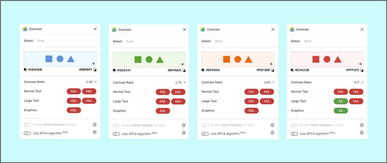
Colours FAILED, contrast ratios under 4.5:1
Orange
We spent a fair amount of time to find replacement colors that would me our blue, green, orange, and red accessible. Blue, green, and red were not difficult.
Orange on the other hand, was a different story.
The Case of Alice
Which of the buttons below do you think will be more accessible for Alice?
Hover to see if you answered correctly.
Sorry, wrong answer.
You are correct
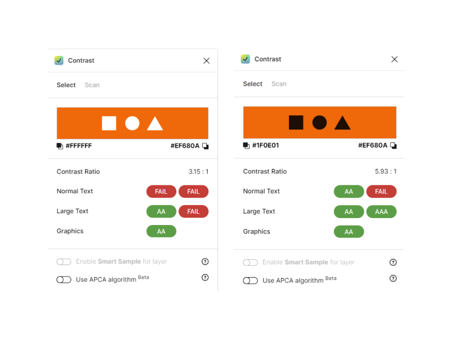
Using Contrast plug-in, it is now clear that the left may look quite clear, but it does not meet WCAG minimum level for contrast.
Why not just use black on orange and call it good?
While using high-contrast colour combinations, such as orange with black, can contribute to meeting WCAG Level AA accessibility requirements, it’s essential to remember that accessibility is not solely about colour choices and colour alone should not be used to convey information. Accessibility standards cover a wide range of aspects beyond colour contrast, including text size, navigation, keyboard functionality, and more.
Here are a few reasons why using orange with black may not always be the best solution:
Aesthetic Variation: Design should provide some flexibility and aesthetic choice. Restricting a design to just one colour combination may limit creativity and user engagement.
Context: The choice of colours should consider the context of the application or website. Orange and black may not always be suitable or appropriate for certain brands or user interfaces.
Colour Blindness: Not all users perceive colours the same way. People with colour vision deficiencies might struggle with specific colour combinations. Ensuring proper colour contrast and providing alternative ways to convey information is crucial.
Compliance with Other Guidelines: Meeting accessibility standards involves more than just colour. It’s essential to address other aspects of accessibility, such as keyboard navigation, alt text for images, and semantic HTML, to provide a fully accessible experience.
In summary, while high-contrast colour combinations like orange and black can be a part of an accessible design, accessibility involves a holistic approach that considers various factors to ensure usability for all users, regardless of their abilities or preferences.
In Search of THE Orange
Adjusting orange to be accessible is tricky. Not enough saturation or lightness will make it brown, too much saturation and lightness can make it black, and going opposite direction can make orange turn brown and eventually black.
During many instances, we’d find an orange we liked but when paired with a lighter shade, at 10%, the orange would become not accessible.
Purchase of MUI
From our experience of updating the handful of colours and fixing or replacing outdated components, a manual update of Aura would be too time consuming.
This issue of time, and that an accessible design system was needed in order to quickly build the home grown SaaS test automation product, gave us the push to purchase a design system.
Once MUI UI kit was installed in Figma, we quickly worked on customizing it. One of my task during that process was to make sure that everything is accessible.
One thing we learned by purchasing a full UI kit was how those more experienced solve the accessibility issue.
MUI Method
The Figma UI kit for MUI comes with basic colours: primary, secondary, red, green, white, black, etc. Each colour will have a main, dark, and light version.
MUI will then take the main colour as the base and create a new and do one of the three:
Reduce the opacity
Add a black layer and reduce the opacity of the black
Add a white layer and reduce the opacity of the white
In order for the text to be accessible, the method is to layer
a base + #000000 60% + #FFFFFF 90%.
After checking the contrast for each, there was one small issue.
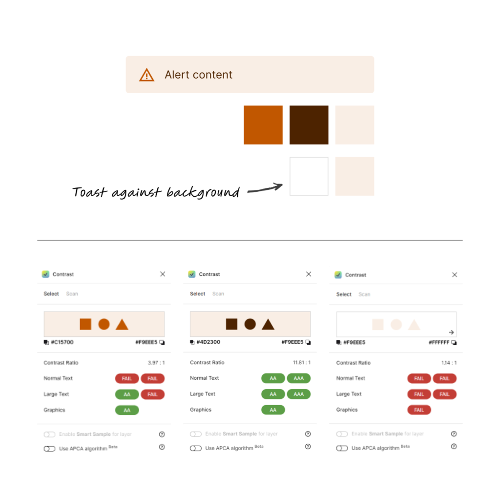
The toast background is not accessible with the white background!
According to WCAG, except for inactive elements, UI components and states needs to be 3:1 against the adjacent colour. For our toast message, when the background is measured against #FFFFFF the ratio is 1.14:1.
Solution
By adding a stroke around the toast. This small addition made the toast comply with WCAG level AA.
Final Deliverable
The final toast message variant is below. By using the same formula for each color and adding a stroke around the toast, each meets WCAG level AA.
Next Step
It took a very short time to understand MUI’s system. Combined with the Contrast plug-in, we could quickly check and update all the components within the design system and release Aura 2.0.
We have placed cookies on your computer to help make this website better. Read the cookies policy


