Progress Bar Redesign

A redesign

Progress Bar

Tricentis, a global leader in software testing, has expanded its offerings to include cloud a SaaS application. This product is the flagship for easy-to-use and codeless test automation that is poised to revolutionize the industry.

In 2022, I became a part of the team, working with two agile teams tasked with developing and implementing four significant components. One of these components was to track the progress of test case “Runs.”

During the Beta testing phase, we observed significant confusion among users regarding the “Progress” column in the data grid. As the primary UX designer for this component, I was responsible for gathering and addressing user feedback, and it became evident that this section required significant improvement.

This case study begins with the formulation of a problem statement, serving as the foundation for my efforts to enhance this small yet critical component.

UX Role

  • Designer
  • Researcher

Working closely alongside PM, content writer, and front-end developer

Tools

  • Figma and Figjam
  • Paint

Timeline

  • July – Sept, 2022

Problem

The Runs progress bar lacks information, especially when a test case fails, affecting its usability.
Man confused
Tester

Goal

Identify and resolve the underlying issues causing this confusion, ensuring users can easily determine whether a test run was successful or not. Additionally, in instances of test case failure, users should be able to promptly identify the count of failed units within the test run.

Background

MUI is used as the base of the design system. The reason why we decided on MUI was because it has the most components, UI and accompanying React codes, that we would need to build the product.

Whilst this new cloud application was years in the making, a lot of the actual front-end design and development wasn’t started until early 2022.

Within a week’s time frame, many of the MUI components were customized and many templates were built. Still, except for adjustments in colour and typography, many components within the design system were still out of the box, as in the case of the progress bar.

Original Progress Bar

Step 1: Builder

A tester needs to verify whether the steps for users to purchase a red cup on a web shop are functioning correctly. In order to test this, the tester creates a few test cases:

  1. A test case to try the login
  2. A test case to try the search/browse feature to find the red cup
  3. A test case to add the cup to the shopping cart
  4. A test case to checkout
  5. A test case to pay

Step 2: Playlist

  1. The tester will then put all the five test cases above into what is called “Playlist”
  2. Tester runs the Playlist
  3. Move on to next task or go to the “Runs” screen to see progress and/or result
A brown hair Caucasian man pointing up
Use case

Runs Result

When a user runs a test case the progress bar below is sufficient. However, when there is a suite of test cases being run, in this product’s case a Playlist, the screen lacks value since a tester cannot easily see how many test cases within the Playlist failed.
Arrow down

User Feedback

As a tester, it is important that we are able to quickly see details about the run, especially when the test fails.
Man with a moustache nodding
Tester

From general user feedback:

  1. After a tester runs their test case or Playlist, they want to mainly see if the run passed or failed.
  2. If it failed, and it’s a Playlist run, how many test cases within that run failed.
Base on the feedback, a competitive analysis was promptly done.
Arrow down
Green frog running through water and water splashing around the frog
Me, excited for research

Competitive Analysis

Example 1
A user can easily see how many of the test cases have passed or failed. This is a good use for within a dashboard. It may though be more difficult to implement in a data grid. Also, while the information of total test cases, how many passed, and failed are shown, it is not very clear what they all meant since they math does not add up. This can cause confusion to users.
Example 2
Another dashboard view where a user can clearly and simply see how many test cases were included in the run. It showed also that five out of the seven have passed.
Example 3
A results bar that is within a data grid. Similar to previous examples, the simple use of numbers above the bar to show how many of the tests failed. One visible issue is accessibility, a user with a red or green colour deficiency will not be able to differentiate the bars well.
Example 4
Via the colour differentiation on the bar and the information below to show what each colour means, a user, even those with accessibility issues, will be able to clearly see how many of the test cases, passed, failed, undetermined, in progress, and have not started.
Example 5
The different colours of the bars and a percentage at the end while attractive, does not give user the information needed quickly. Having the percentage at the end may be useful for users although it would most possibly be easiest if users were given the exact number of pass and/or fail instead of a percentage.
Previous slide
Next slide

Ideating

I worked closely with the front-end developers on the redesign of this progress bar to ensure that the new progress bar would work the way it’s supposed to, both in how it would look on screen and the backend capabilities.

I had to remember that change has to be as close as possible to what’s already in the design system in order to keep the cost down. Also, the accessibility issue between the red and green colour. 

Minie thinking
Me remembering

Red and Green Issue

When placed next to each other, the two colours are not accessible. For those who are not able to perceive red or green light, or those who have partial or total absence of colour, the two colours look the same.
Arrow down

To learn more about colours and WCAG, you may find this video I created and presented to the company insightful. 

Keeping the above and competitive research findings in mind, I checked out our different design system components. I wanted to see if we could use and combine any of these components to give users what they need and make using the test run results more enjoyable.

To combat the accessibility issue, a cheap solution was to add a white line to separate the green and red.

A few design ideas came to mind

Rachel from Friends excited
Excited UX designer

Progress Bar + Helper Text

Idea 1

A simple tweak of the progress bar to show three colours green, red, and blue.

Then enabled the helper text variant, a default of MUI, to show how many are running, failed, passed, pending, and cancelled.

When users hover, users can see detailed info about the test run.

Progress Bar + Badge

Idea 2

The next design idea was to combine the tweaked progress bar with a badge. With this design, users can easily see how many test cases passed and failed. 

In idea one and two, when a user hovers over the progress bar, the user can see how many is still running, how many has failed, how many is pending and the total.

Progress Bar + Icons

Idea 3

The first design seemed to be missing some umph and the second looked too clunky. Also, they don’t seem to really solve the user’s problems to where they can easily see all the information without hovering. I felt like this progress bar can be better.

The third idea that came to mind was a combination of the progress bar and the icons used on the Playlist Manager screen to indicate the five latest runs. The Playlist Manager is the first page users see when they click on the Playlist menu option. 

For visual reference, below is what the last five runs look like on the Playlist Manager screen.

Marrying the latest runs icons and progress bar, this design came about. There is no need to hover, all the information that users need to see is all visible on the grid.

Arrow down

Solid Progress Bar + Icons

Idea 4

This last version was created for testing purposes. I wanted to see if there is a preference for the bar itself, if the information or icons on the helper text area was sufficient or if the bar design is important also.

Usability Testing

The designs were peer-reviewed by all the SaaS product UX team members, and anybody else within the greater UX team that had time to review. Small refinements were made and a usability test was prepared.

The usability test was done via remote interviews to internal testers. Since it’s a new product and with a slight time constraint, we didn’t have access to external testers.

Pilot from the Simpson's show testing the blackbox
Prepping usability test

Test Prep

Moderated remote user interviews with our internal (Tricentis) testers.

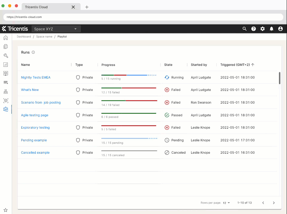
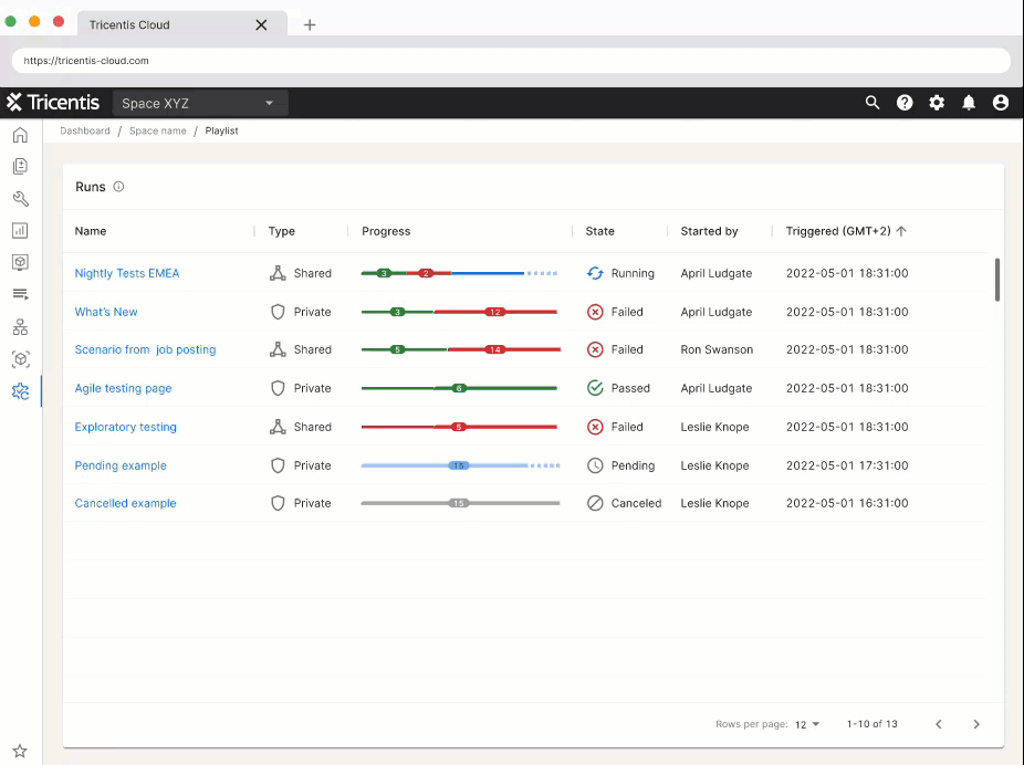
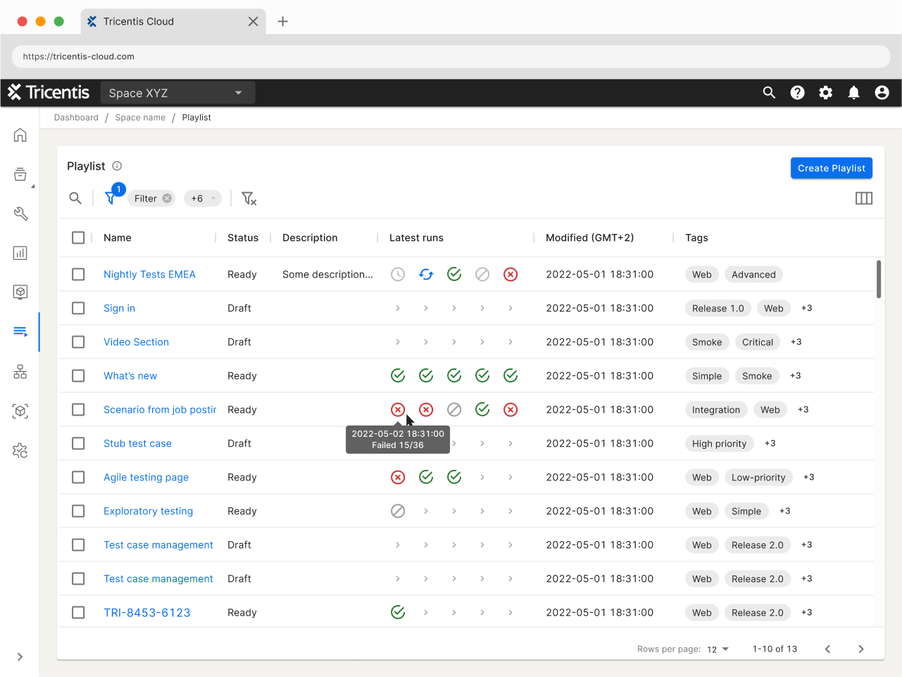
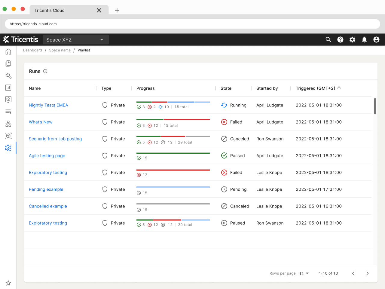
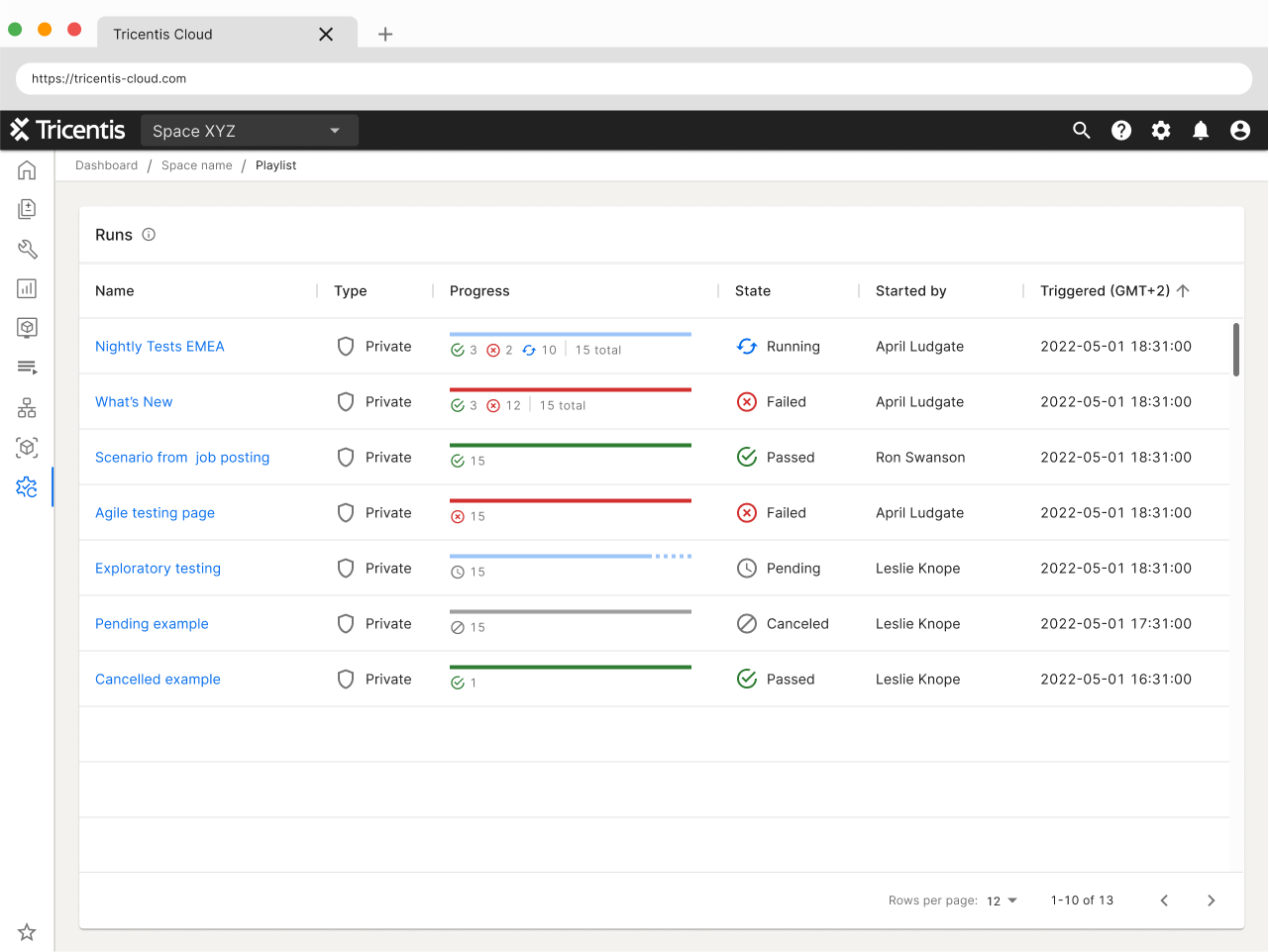
The scope of the usability test was the progress bar on the “Runs” screen of TTA. We were conducting a set of usability tests to discover whether the progress bar prototypes fulfilled what testers needed to see when seeing a progress bar within the Runs screen.

We conducted the moderated remote user interviews to identify the potential shortcomings and identify the best solutions for the progress bar in the run screen.

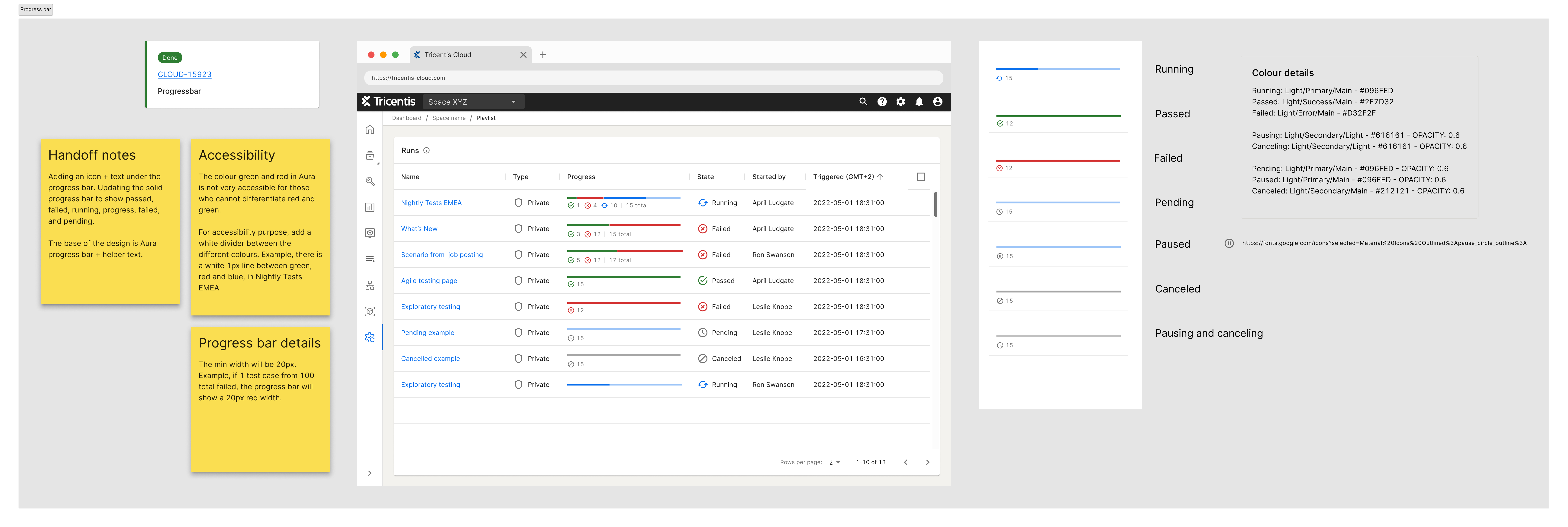
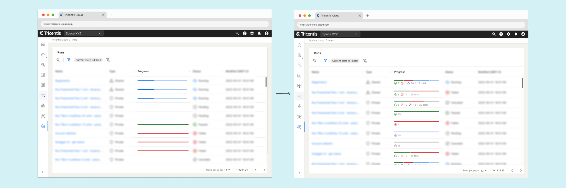
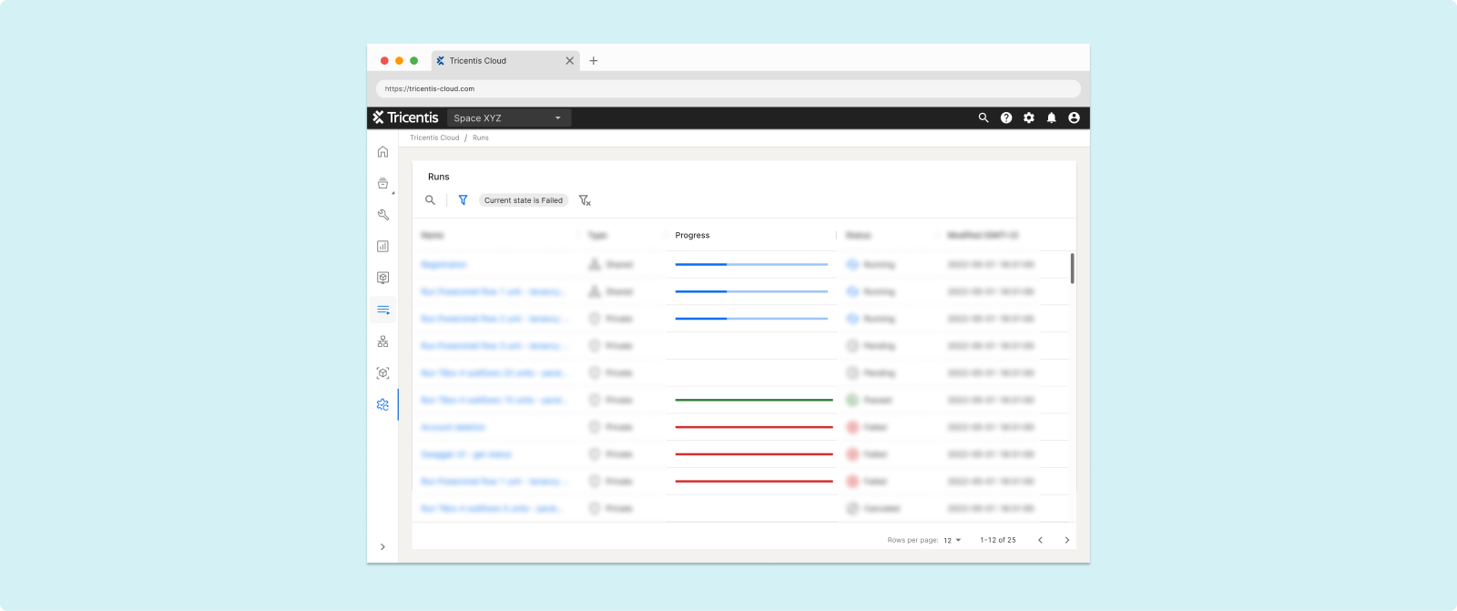
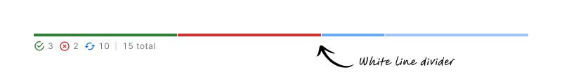
The progress bar for TTA Runs is just a solid line.


Untitled

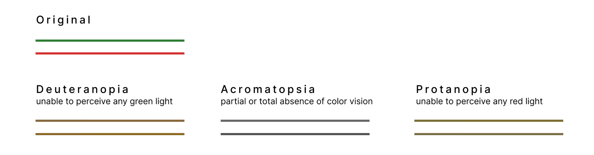
  • Green to indicate passed
  • Red to indicate failed
  • Blue to indicate running
  • No line indicator for cancelled or pending
  • A tooltip oh hover showing how many succeeded

There have been requests from users for the progress bar to show more, particularly in the case of a run with multiple units, to see how many failed and how many passed.

Qualitative data will be collected to answer the following questions:

a. What information do testers need to see when looking at a progress bar?

b. What is the next flow of work upon seeing the information from the progress bar?

c. When seeing the prototypes of the progress bar does it give testers the information they need?

d. Which of the prototypes communicates the information best, which is less preferable?

e. What desired information is still not given or clear from the progress bar prototypes?

The user testing will give us the qualitative data needed to go forward with the design for the progress bar.

Timeline and outcomes contingent upon participant availability.

  1. Recruit participants
  2. Usability testing interview
  3. Analysis of test interview
  4. Refine prototype

Thanks for joining me today for this user interview.

You are not being evaluated, and there are no right or wrong answers. This study aims to learn how

difficult or easy it is to interpret the data presented in the progress bars.

We want to improve our software, so please provide both negative and positive feedback today.

Before we get started, I’d like to get your permission to record this session. This is for internal purposes

only and we will not share this video outside of Tricentis.

(Permission) Thank you.

(Recording starts) The recording has started. For the record, can you please state that you give us

permission to record this session?

(After restating) Thank you.

Before we get started, I have some preliminary questions for you. This way I have a better understanding of who you are and your role.

  1. What is your role within Tricentis?

  2. How many years of experience do you have in software testing?

  3. What kind of software testing do you currently perform?

  4. What kind of software testing do you perform most often?

  5. How much time do you spend in your current software testing solution per week?

I will now share these prototypes with you. (FigJam file)

(After the user has access, make sure the user can interact) Can you move the prototypes around?

(Move to questions if all is good and if not, troubleshoot)

  1. Seeing a view like this, what do you think this view communicates to you?

  2. Seeing the progress bar, what kind of information would you need to see?

  3. Does this progress bar communicate to you the information needed?

  4. Base on your answer, please put the designs in order of best to less preferable. The clarify, best would be one and less preferable would be four.

  5. Why did you put the prototypes in this order?

  6. Tell me one-by-one

a. What you like about it

b. What you don’t like about it

  1. Is there anything that is not clear?

  2. Is there anything that you need but is not presented in the prototypes?

That is all the questions I have. I appreciate all the feedback given. Is there any other additional feedback

you’d like to share with me before we end this call?

Thank you and goodbye

Although a script was prepared, flexibility was maintained during the interview process. The script mostly served as a helpful guide to ensure no questions were overlooked and to also a backup plan in case of nervousness or brain fog on my end.

After preliminary questions, ice breakers and also to get to know the testers, they were taken to a Figjam board. The setup is like the example below.

NOTE: The below was created for this case study, I do not have the original results.

The interviewees saw the top half of the board, the purple section with just the prototypes and purple number cards. 

The reason for the number cards was, during the first interview, the interviewee was struggling to order/move the prototypes. I had to come up with an on-the-spot solution and these cards did the trick. The interviewee was to move the number card, one being the favourite and four being the least favourite, to the prototypes.

On a different Figjam board, the grey section, I kept notes in the form of sticky notes.

Findings

Likes:
  • Users loved the icons under the progress bar best, second with just the text
  • Seeing the total test cases within a Playlist was a nice bonus
  • Not having to hover to see more details was preferred
  • Users preferred the progress bar to be more than just a solid line
Dislike:
  • The badge design, it was too much like a Christmas tree

The usability test, including the script and findings, was shared with the company via Confluence.

A very excited woman holding a piece of paper, smiling,and punching air
Unanimous response

Final Deliverable

Refinements were made based on the usability test results. Then front-end and back-end developers gave it a final review and feedback. Once the refinement was complete, and a quick look by the PM, the files were ready to be handed over to the front-end developers.

The handoff included the Jira ticket, and even though the front-end developer and myself have discussed the handoff details in person, I added sticky notes to ensure that fewer thing be missed.

User Feedback

The small but significant improvement was demonstrated during one of our product showcases. The response was very positive. In summary:

  • Clarity:  when testers glance at the progress bar, they can quickly see number of failed test cases
  • Efficiency: information given helps testers make the next decision faster
  • Accessibility: Components that are inclusive and accessible to users with colour deficiencies
  • Aesthetics: An aesthetically pleasing design that enhances the overall user experience

What I Learned

  • Minor adjustments based on user needs can yield substantial results for the users
  • Collaborating with front-end developers and involving back-end developers in the early stages of ideation contributed to a smoother hand-off process
Elaine, George, and Seinfeld dancing
Me and the team after a successful push
We have placed cookies on your computer to help make this website better. Read the cookies policy
yes, I accept the cookies